There are a lot of people interested in data right now and there are a lot of visualisations to make that data easier to consume for people who are not data scientists. However, like any branch of statistics, visualisations can easily mislead. We are programmed to see patterns. If we are presented with a graphic that supports the surrounding text then we are more likely to believe the argument presented without further research1. I wrote about this on the Royal Statistical Society Data Science Section Blog in May, where reversing the colours in successive graphics can cause confusion. I’ve seen further examples and one caught my eye this month because it was being called out.
In the middle of July I saw this tweet:
The thread highlights that the numbers have changed and that this is never highlighted. Andisheh has been taking screen shots and is clear that the numbers assigned to each colour change each day. He correctly asserts that this is “an infographic that hides data instead of showing it” and that this is “violating data visualization best practices”. He is 100% correct.
I took a look at the figures myself over several days2 and you can too here. Here is the data from 27th July:
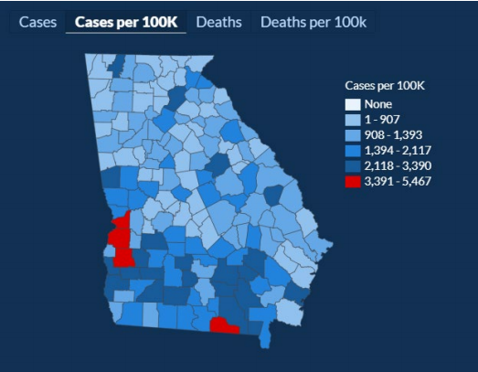
If you compare to the two images that Andisheh posted you can see that the boundaries for each group have changed again although the overall image still looks the same. What was interesting to me was that this time it was not an increase across the board. Apart from the upper boundary of the red group increasing, all of the values had dropped slightly. So what is going on?
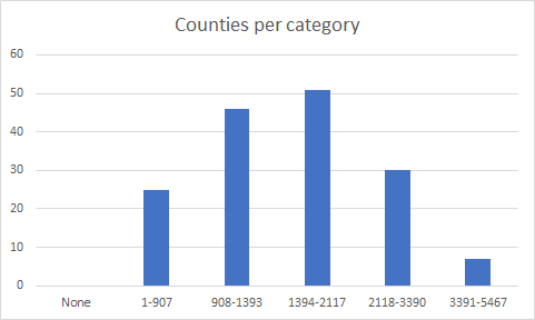
The data must be split into 5 groups (plus 0) so that they can be consistent with colours and previous reports. I took a look at the raw data for 27th July and you get a bell curve for distribution across the categories.
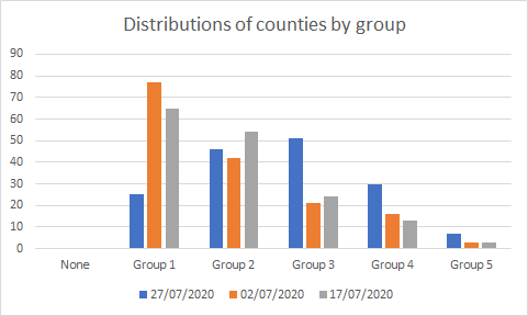
I couldn’t get the raw data for the graphs posted by Andisheh but I did count by eye. You do not get the same curve or the same number of counties per group, instead the data does show a shift to more counties with higher numbers of infections over time. This is not a case of applying the same number to each category or similar distributions that could easily explain the shifts in boundaries.
I suspect that this is a case of hiding the truth in plain sight. By having a bright red as the highest group and similar shades of blue for all other groups it is very difficult to see anything other than the few counties with the highest rates and this is what our brains will naturally pick out.
It is impossible to say whether this is a deliberate attempt to obfuscate the data and make it seem like the rates are stable, while at the same time having the alibi that the data was clearly presented, or at its most benign if this is simply a case of overworked individuals not following best practise. What is true is that the colours are very deceptive and the changing boundaries make it impossible to see the changes over time. I cannot believe that any ethical data scientist would not have shouted about this.
We are in a constantly changing situation and you will be bombarded with data. It is human nature to present data to support your own narrative, so approach what you see with a healthy scepticism. There will be simplifications and assumptions in what you are given. Look at the raw data if you can. If you are limited to graphics take note of the descriptions and compare them with previous versions.
If all else fails, ask a friendly data scientist 🙂
Esta deve ser a melhor coleção de blogging site que eu descobrisse. Teena Yale Edmonda