One of the things I love about is how customisable it is. Separating content from design a long time before web design cottoned on to this. However, out of the box,
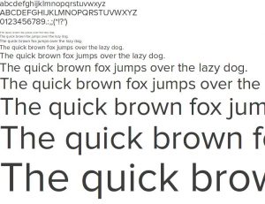
comes with very limited fonts and most people just use these defaults, mainly because setting up other fonts isn’t as easy as it should be.
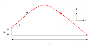
One of the great things about drawing diagrams in is that the fonts match, it’s always a little jarring to my eye when I see papers with a mismatch between diagrams and main text. However, sometimes you just can’t control what’s in your diagram or you want something a little more modern than Times New Roman for whatever you’re putting together.
So how do you go about doing this? Like most things, the answer is “it depends”… let’s start with an assumption that you’re starting from scratch and if you’re already a few steps down the process then that’s just less work for you to do 🙂 Continue reading True Type Fonts in LaTeX: a brief guide


